In this blog post, I will cover the outer strands of the vast web we know as branding. I’m going to provide you with a basic, fast-forward version of creating a brand style guide.
We’re going to break down each component of building a brand style guide. Then at the end, we’ll tie it all together by creating a style tile.
Branding Essentials
Before we break down the components of the style guide, we need to identify a few branding basics.
1. Target Market:
Who is your audience?
What is the problem that you’re solving? Who does it apply to? How many other people are out there with the same problem?
2. Brand Name:
This is everything.
Often, companies choose names that immediately identify with their market or services, others use: puns, choose to be ironic, bold, but mostly trendy.
3. Brand Meaning:
What do you stand for?
Think of this as what would go around your family crest – your “E Pluribus Unum”.
4. Brand Appearance:
Avoid the indistinguishable.
You obviously want your name and logo to stand out from the rest in your market. You can often achieve this through KISS.
Let’s Create A Style Guide For Our Fictional Brand
For a test run, I have created a fictional brand. Let’s see how things pan out, eh? Since it’s 2015 and we’re supposed to have our hoverboards by now, it only seems relevant to have a startup company creating these.
Volr is a derivative of the French word voler; which, means “to fly”. Since “Voler” is already an established cycling apparel brand, I did the trendy thing and dropped a silent letter to keep the word, but implying a new identity.
Behind the Logo
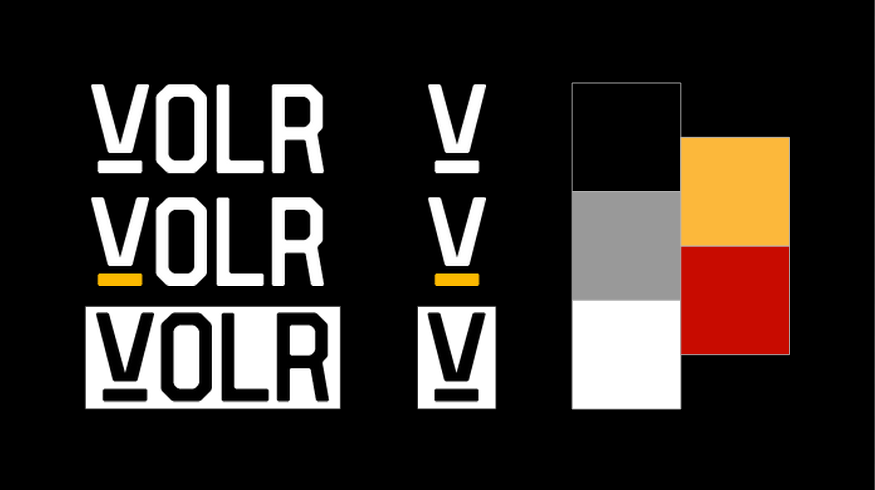
After figuring out a name, I stuck to my KISS rule, and made a logo in 15 minutes.
The name implies flight, and so does the logo now. It’s subtle, like the FedEx logo. This the created with the intent to have a business synonymous with flight, or hovering; thus, allowing more SKU’s to be created or business expansion beyond the hoverboard. So, we have the “flying V” floating above a bar of energy. This will also be a theme throughout our hypothetical products.
If you need to hire a designer to help create your visual identity, I suggest the following sites:
Design inspiration:
- Canva Design School – Negative Space Logos
Color Theory
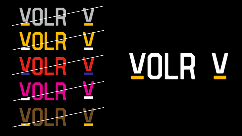
The color you choose will drastically affect the way your brand is perceived. Here’s an example of big brands swapping colors, just to show you how much one associates colors with branding.
Column Five & Marketo came out with a great infographic for choosing your brand colors and how they apply to your target market. MaterialUp is a quick fix for RGB color schemes.
Column Five & Marketo tell us that:
• Yellow is reminiscent of the sun, it communicates hope and optimism. Yellow stimulates creativity and energy, and it’s brightness is especially useful to catch a customer’s eye.
• Black is used by companies that wish to boast a classic sophistication. Black works especially well for expensive products.
With yellow as our core color, I’ve selected black as the secondary to complement energy with sophistication. Black & Yellow all day.
Typography
For your brand font, you need to choose something legible, and scalable. If you can’t see it or recognize it as a favicon, you need to create something more flexible.
The fonts I chose:
- Branding Typeface: Vincent
- Web Typefaces: Source Sans Pro
Here are some other great examples of font pairings for your brand style guide:
- femmebot – Aesop’s Fables Meets Google Fonts
- Canva Design School – Best Free Fonts or Brand Fonts
Imagery

You need to establish whether or not illustrations, CAD, photo shoots, or some combination of the sort will be used in your imagery. Maintaining this consistency throughout all of your brand collateral will result in greater brand credibility.
Also, if you’re going to stylize images (like the black and yellow photos in this post), Photoshop Actions will be key to creating the same effect with every image. For example, I am adding a Gradient Map layer in Photoshop to my images, and changing the two colors to yellow and black. This is a Photoshop Action we want to use consistently.
Free stock photo resources I subscribe to:
Voice
The way your brand speaks to the general audience will determine how people interpret your brand; it will either engage your audience, or it won’t.
At Content Harmony, we like to use this image from socialmediaexplorer.com as a cheat sheet to find the right brand voice and tone to include in a brand style guide.
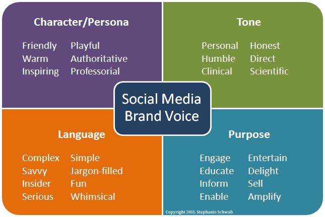
Two other resources we like for establishing brand voice and tone are Distilled’s guide to Finding Your Brand’s Voice, and MailChimp’s VoiceandTone.com.
Build A Grid
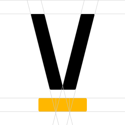
Grids are really helpful to creating a cohesive brand style. You’ll want to use the grid on everything. Use it for print collateral layout, product design, UX and UI, and so on. Creating a grid to encompass your branding may seem excessive, but everyone using your brand style guide will thank you.
Example of a simple grid created from the logo:

Example of a blog header image using the grid:


Thanks to pixelbuddha.net for R2D2.
Putting It All Together In A Style Tile
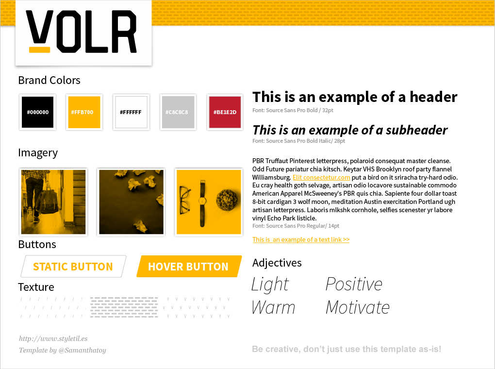
A style tile is not the same as brand style guide, but it’s a great starting point. Head over to StyleTil.es and download a template.
Once your company gets further along, you can create a full-scale style guide. Canva Design School compiled a great list of examples of 50 Meticulous Style Guides.
Examples:
- Black Watch Global
- Duke University Style Guide Site
(entire subdomain)
Now you should have plenty of helpful hints and resources to build your brand style guide. With this in hand, your designers and other content creators will be able to communicate easily, and keep your visual brand identity consistent.
✉️ Get an email when we publish new content:
Don't worry, we won't bug you with junk. Just great content marketing resources.
Ready To Try
Content Harmony?
Get your first 10 briefs for just $10
No trial limits or auto renewals. Just upgrade when you're ready.
You Might Also Like:
- The Wile E. Coyote Approach To Content Guidelines
- Content Brief Templates: 20 Free Downloads & Examples
- The Keyword Difficulty Myth
- How To Find Bottom of Funnel (BoFU) Keywords That Convert
- Bottom of Funnel Content: What Is BOFU Content & 10 Great Examples
- 20 Content Refresh Case Studies & Examples: How Updating Content Can Lead to a Tidal Wave of Traffic 🌊
- How to Create Editorial Guidelines [With 9+ Examples]
- Content Marketing Roles
- How To Write SEO-Focused Content Briefs
- The Content Optimization Framework: [Intent > Topic > UX]
- How To Update & Refresh Old Website Content (And Why)
- 12 Content Marketing KPIs Worth Tracking (And 3 That Aren't)
- 16 Best Content Writing Tools in 2024 (Free & Paid)
- How to Create a Content Marketing Strategy [+ Free Template]
- How To Create Content Marketing Proposals That Land The Best Clients
- What Is A Content Brief (And Why Is It Important)?
- How To Create A Dynamite Editorial Calendar [+ Free Spreadsheet Template]
- How to Use Content Marketing to Improve Customer Retention
- Types of Content Hubs: 5 Approaches & 30+ Examples
- How To Do A Content Marketing Quick Wins Analysis

