Getting your site architecture right is one of the harder parts of building a site, whether you’re dealing with millions of pages or hundreds.
In particular, one of the most common confusing situations we encounter in content marketing is how to handle things like “topic clusters”, “content hubs”, and “pillar pages” (the list of names just adds to the confusion). We get this question all the time internally from team members, and from clients, and it’s one of the most common questions I see on Twitter and in SEO communities like Traffic Think Tank.
But – I’ve never seen someone publish a really great list of content hub examples, nor have I seen anyone document the different types of content hubs.
So I’ve decided to finally sit down and document my own mental framework for different types of topic clusters, and share my private list of content hub examples, too.
Think you’ve got a great content hub example that deserves to be on this list?
If you’ve seen or built a great content hub and think it deserves to be on this list, leave a comment below or ping me on Twitter. I’ll publish all the comments that aren’t spammy, and if it’s a really exceptional example I’ll add it to the article.
1 – Classic Hub & Spoke
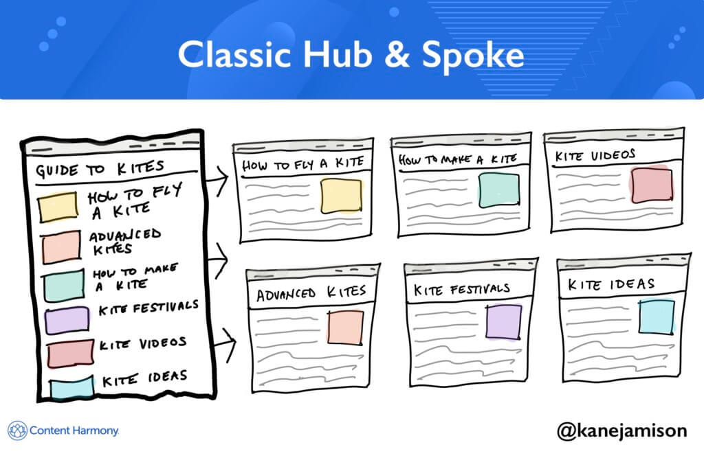
Format: Parent page plus 5-20 static subpages.
One head page, 5-20 static subpages. That’s the classic Hub & Spoke model of content hubs.
Most content is evergreen, and the subpages don’t tend to change much. The content is published and updated occasionally but is generally fairly static.
It’s tried and true and it works great for many topics, and sometimes you don’t need to reinvent the wheel (I swear I’m not trying to make a joke about ‘spokes’ here).
This framework works best when your content won’t change much. If you plan to be constantly adding new content about the topic, you may want a more dynamic page template, like the Topic Gateways mentioned below.
Classic Hub & Spoke Examples
- Podia’s How To Create & Sell A Profitable Online Course (see chapter listings towards bottom of page)
- Zapier’s Learn Guides, eg The Ultimate Guide To Remote Work
- Insteading’s Tiny House Guide
- Big Fish Game’s Texas Hold ‘Em Guide (via Archive.org)
- Airbnb’s Neighborhoods Guide – I will say this is a favorite content example of mine, I’ve written about it before, and it is woefully underinvested and has so much more potential than its current form.
- SecurityNerd’s Apartment Security Guides – I think this page could benefit from more static content in order to give the parent page a better shot at ranking for “apartment security” keywords, but if you’re not sure where to start on adding pillar pages to your website and you already have some strong spoke pages to include, this is a great and easy starting point: just list each guide with a paragraph description and a featured image, and add the parent page into your site navigation. These spoke pages are great examples of valuable affiliate review pages, too, so this is a hub page that can drive conversions.
- Plurilock’s Behavioral Biometrics Guide – this is pretty niche stuff so I won’t pretend to understand it all, but that’s OK – I’m not the audience! I love sharing examples that go into really niche topics because it’s likely that Plurilock can accurately claim to be the world’s best resource on this subject after producing a guide like this. That’s the entire goal of content marketing in most B2B settings.
- Clique Studio’s What Is Web Design Guides – This is a good set of 101/introduction level posts about web design that help Clique build relevance with Google and earn some links over time, and help attract users to topics deeper in the funnel, such as website footer design examples, which is likely a post their team can share with clients when trying to actually go through their design process.
2 – The Content Library
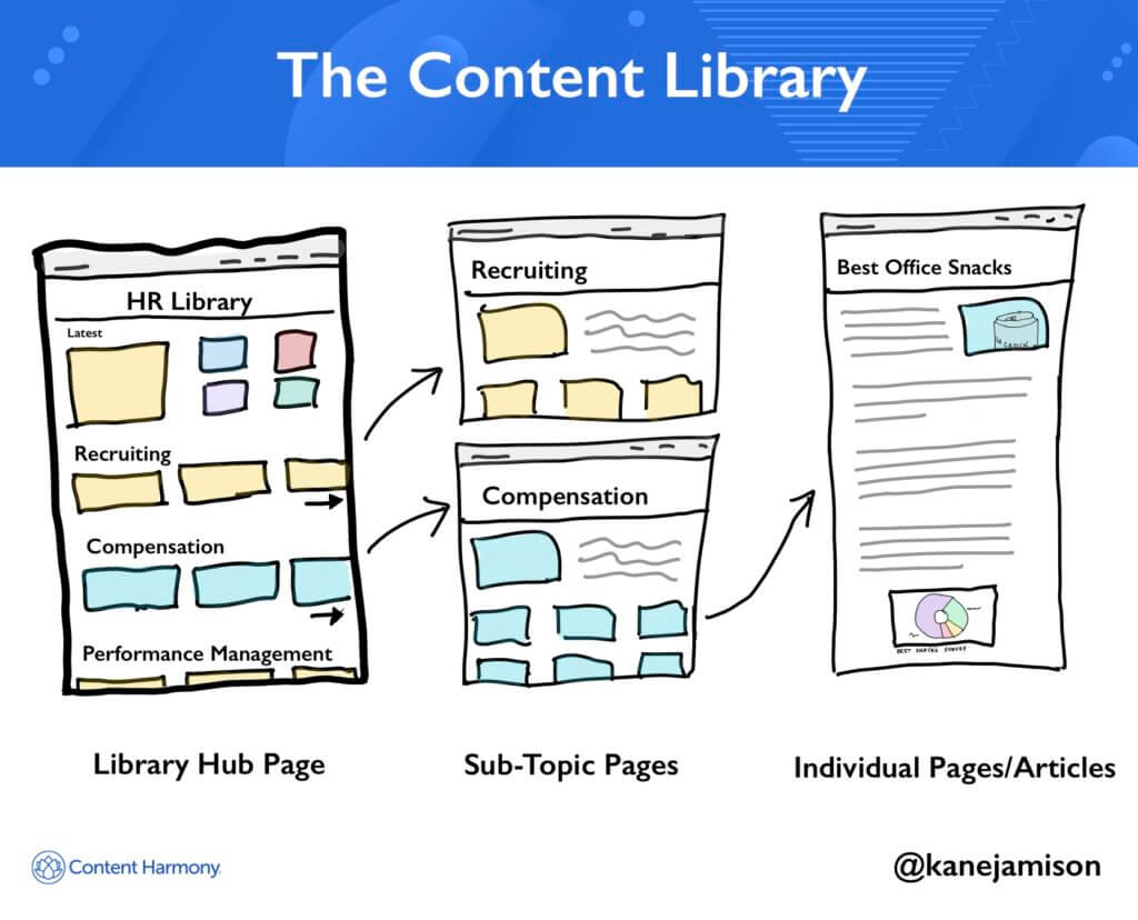
Format: Parent page listing individual content by category or subgroup, plus links to those sub-category pages.
The Library approach is the way Blog homepages should be built by default.
Tons of content sorted into categories, highlighting both evergreen popular content as well as fresh content that was just published.
This is generally the best way to approach blog taxonomy rather than a ‘newest content first‘ default that most blog CMSs default to. The Animalz team has done a good job of explaining this in their post, Your Blog Is Not A Publication.
The Library is the right approach to use when you have a lot of content about a variety of different subtopics, and there isn’t one clear way to sort all of them. When you have a lot of content about a more specific topic, you should use a Topic Gateway, which we’ll discuss next.
Content Library Examples
- LiquidWeb’s WooCommerce Hub (via Archive.org)
- HelpScout’s Resources & Guides
- Corporate Finance Institute’s Resources section
3 - The Topic Gateway
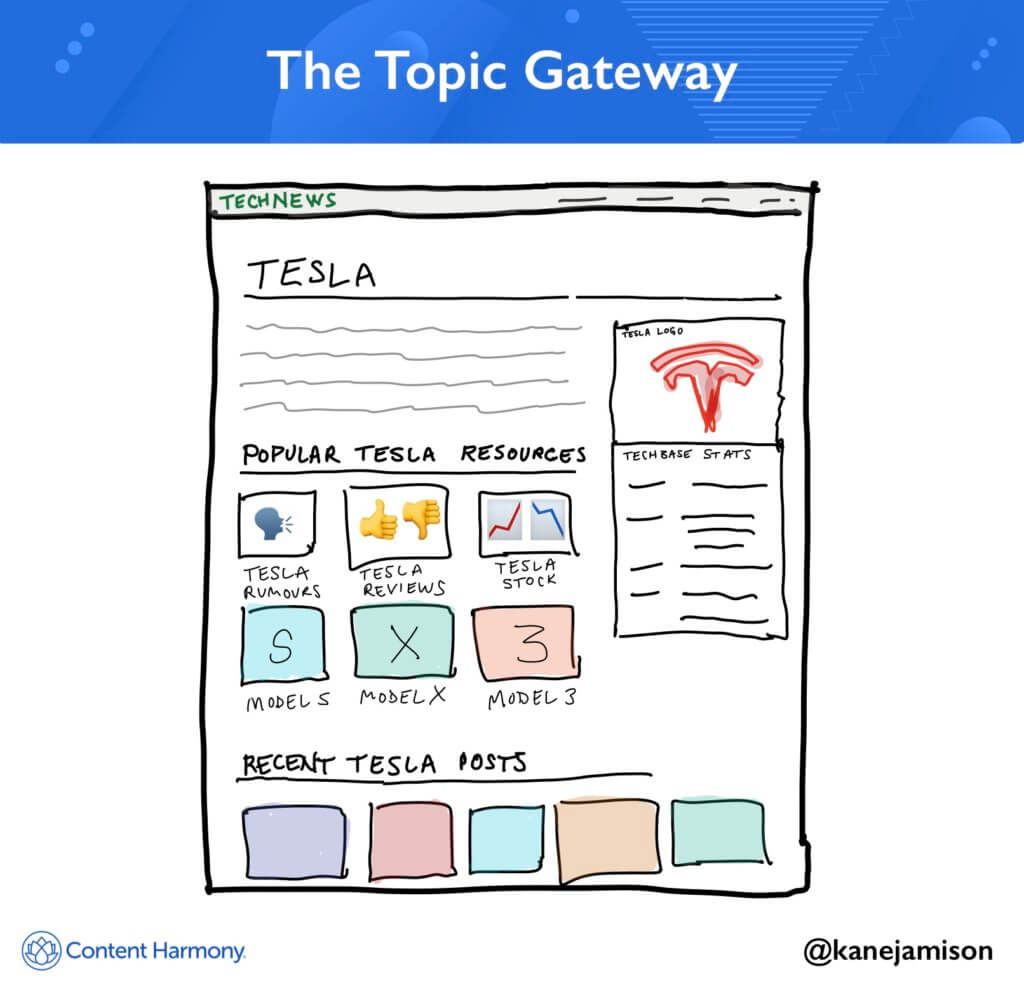
Format: Dedicated page with topic overview and links to evergreen resources, and usually ending with dynamic links to recent content published for that topic.
Topic Gateways are like blog category pages on steroids.
Instead of your classic blog category page which lists a bunch of posts in the category, you build a decent page of static content giving an overview of the topic, and then link to subcategories of content.
Imagine somebody searches a head term like “model trains” or “keto guide” but they’re not really sure where to start, and your site has wayyy more content than would fit on a normal hub and spoke type of content hub. That’s a great scenario to build out a Topic Gateway that gives brief overviews of key aspects of the topic, and then points the user towards further resources they should start with.
Honestly, many Wikipedia pages are good examples of this, by giving large overviews of a topic with tons of internal links for a user to browse further depending on what they want to learn more about.
How is a Topic Gateway different than a Content Library format?
Well, library formats tend to be large and encompass more topics, eg a library of content about Human Resources. Gateways tend to be a better fit for a user looking to deep dive in a single topic group, eg Employee Onboarding.
As a result, Gateway & Library formats play well together – try formatting sub-category pages inside of a content library using the Gateway approach. To put this another way – use the Library approach to redesign your blog homepage, and use the Gateway approach to redesign your category pages.
How is a Topic Gateway different than an “Ultimate Guide” format?
Honestly, the overlap is huge here. Lots of examples below are category pages with static content, but there are also lots of long-form guides with tons of internal links. The difference is kind of moot – whether you publish an awesome long-form Post or Page or Category page template doesn’t matter so long as you interlink the page well with the rest of your website, and use the page to drive readers and traffic deeper into your site and your conversion funnel.
Topic Gateway Examples
- CompareCard’s Blog Category Pages, eg Balance Transfers.
- DietDoctor’s Keto for Beginners Guide – not literally a category page, this is a static landing page that is filled with every nook and cranny someone might want to explore when they are researching a ketogenic diet.
- Drift’s Guide to Chatbot Technology – this is a great example of a really custom page design and layout that doesn’t feel like it was cobbled together. The page has solid chapters of standalone value to readers, but also does a good job of driving traffic to mid-funnel education pages (“Still curious? Click here to find out How does a chatbot work?“) as well as bottom-of-funnel conversion pages (“Still curious? Click here to learn about the benefits of chatbots.“).
- Insteading’s Chickens Hub Page – This is a publishing site that we own. We’ve built these to function as advanced category pages, pushing evergreen content like building chicken coops, raising chickens, and information on specific chicken breeds to the top of the page. Then we’ve listed other miscellaneous chicken content show up in the most recent content section at the bottom.
- VetStreet’s Complete Guide To Caring For Dogs
- Traeger Grills’ Thanksgiving Guide
- Tofugo’s Learn Japanese: A Ridiculously Detailed Guide
- WineFolly’s Wine Basics: A Beginner’s Guide To Drinking Wine
- PainScience’s Types of Body Pain
And here’s a few good examples of sites or pages that could benefit from *becoming* more of a gateway page to other content, if they went through and added more static content to the pages.
- Techcrunch’s Tag & Entity pages, eg techcrunch.com/tag/tesla/ – imagine what a robust page this could be if it had static and evergreen content for top Tesla topics alongside ‘recent stories’.
- Model Railroader Magazine’s Beginners Guide page has some of their essential content for people looking to get into model trains, and they’ve made a smart choice by adding it to their navigation with a Getting Started link. This is a classic blogger approach, to build a Start Here page into the navigation that has the site’s manifesto and “greatest hits’ content on it, but it’s rare to see larger publishers do it and rank for phrases like “model trains beginners guide”. But the page could and should be developed further similar to the Keto Beginner’s guide mentioned above.
4 – The Content Database
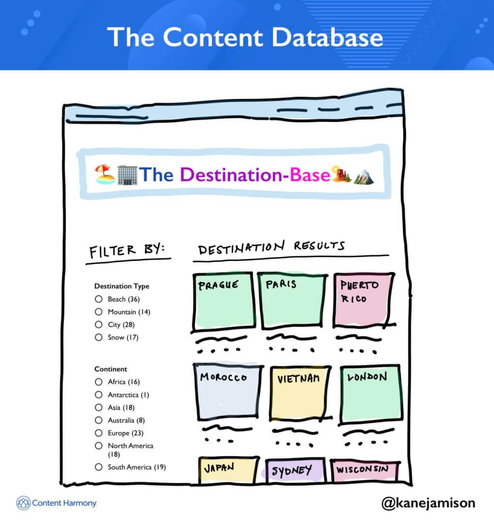
Format: Hundreds or thousands of child pages, sortable and filterable by taxonomies.
The Content Database model is perfect situations where you have tons of potential child pages, you want to let users browse and explore, and you plan to potentially add more content in the future.
Oftentimes these will show up as variations like a Directory (such as a directory of businesses), a set of examples of something that you can search through, or in structured formats like Glossaries that define a set of topics.
Use these when you have a substantial amount of one content type for users to explore, and when users will want to filter their own custom lists for inspiration or to find a needle in your content haystack.
Content Database Examples
- AdEspresso’s Facebook Ad Database – awesome for browsing Facebook ad examples. (Note, it appears this got turned into a regular blog post by their team, possibly due to shift in search intent. See the old version on archive.org)
- Content Harmony’s Content Marketing Examples Database – our own humble content database showing off content marketing examples that we love.
- Muscle&Strength’s Workout Database – visual database, not dynamically filterable, but with buttons to keep exploring by gender and workout type.
- Bigger Pocket’s Hard Money Lenders Directory – find real estate lenders by geographic location.
- GreenRoof.com’s Green Roof Project Database – find examples of green roof projects by location.
- Sole Collector’s Collectible Sneakers Database – browse through a database of collectible shoes by brand and product line.
- The Kaplan Group’s Alternative Financing Directory – sort through a list of alternative B2B financing lenders.
- Audubon’s Guide to North American Birds – sort birds by their family and region, click to hear their audio file quickly, or click for a full page of information on that species. Their species pages are excellent content examples, too, check out this page for the Barn Owl.
- LemList’s Cold Email Templates Hub – Good list of posts describing cold email outreach templates that were successful and why. This one isn’t a huge database but could grow over time, and even with a small number of entries compared to some examples above, it does a great job of drawing you into each particular post because there are strong insights in each one.
5 – The Topic Matrix
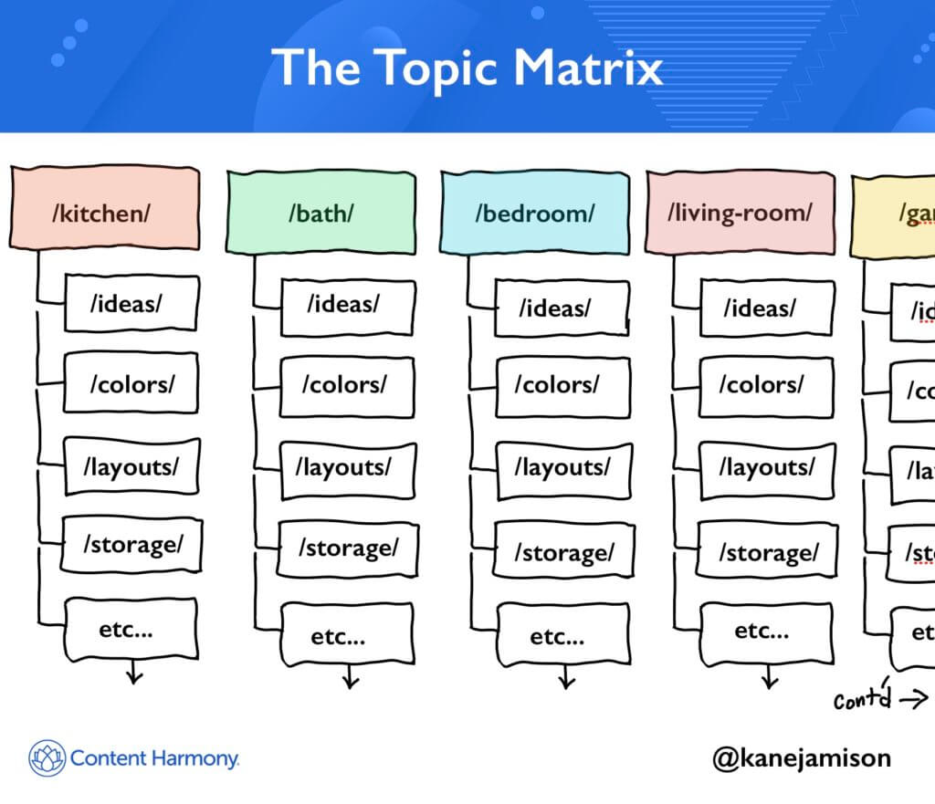
Format: Consistent subpages across an index of tens, hundreds, or thousands of parent pages.
The magic element of a Topic Index is really the set of consistent subpage types. By building large volumes of consistent content you can spend more time investing in advanced page formats that will make your UX way better than a competitor’s generic blog post.
The Topic Matrix concept often shows up in the form of a complete site architecture – think of these types of examples:
- Yelp divided up by location and business type
- Redfin or Zillow divided up by cities, neighborhoods, and types of homes.
But, while it’s typically used for key conversion content and landing page systems, it’s also possible to build Topic Indexes for more informational types of content — or at least blend more informational content into your landing page system.
Topic matrixes can be deep – with lots of subpage types – or wide – with extensive sets of parent pages.
Medical sites are a good example of this – you might have a series of lots of disease and conditions pages that show up as hubs, and subpages under each hub that are consistent for all drug types.
Can you show me an example?
Let’s look at MayoClinic’s Diseases & Conditions hub as an example of this (I’ve edited URLs slightly for illustration purposes):
- https://www.mayoclinic.org/diseases-conditions/
- /acl-injury/ (primary condition page)
- /symptoms-causes/syc-20350738 (repeated subpage type)
- /diagnosis-treatment/drc-20350744 (repeated subpage type)
- /doctors-departments/ddc-20350745 (repeated subpage type)
- /agoraphobia/
- /symptoms-causes/syc-20355987
- /diagnosis-treatment/drc-20355993
- /alcohol-use-disorder/
- /symptoms-causes/syc-20369243
- /diagnosis-treatment/drc-20369250
- /doctors-departments/ddc-20369252
- /care-at-mayo-clinic/mac-20369256
- etc. for thousands of other conditions
See how each disease or condition has a Symptoms & Causes page that acts as the main page for that condition, and then a set of optional subpages like Diagnosis & Treatments, Doctors & Departments, and finally Care At Mayo Clinic if it’s a condition they’re looking to drive patients towards?
Many will look at this and say “that’s just good site structure” and they’re totally right, but, how you build this into your site’s URL and navigation structure is a pattern that can be reused in many types of content.
I don’t want you to miss the conversion part I mentioned there, either, because that’s a huge element of how Topic Indexes can be successful:
Mayo Clinic is a good example of using educational content and flexing their domain authority and trust to drive site users towards care pages like https://www.mayoclinic.org/diseases-conditions/alcohol-use-disorder/care-at-mayo-clinic/mac-20369256 that can educate people on services that they offer.
Topic Matrix Examples
- Mayo Clinic’s Disease & Conditions hub, Tests & Procedures hub, and others for Drugs and Symptoms.
- TheCultureTrip’s site architecture split up by Travel Destination (Puerto Rico shown as an example in the list below, but they have many more articles and destinations on each hub page):
- theculturetrip.com/north-america/caribbean/
- /north-america/puerto-rico/
- /caribbean/puerto-rico/ (interestingly this subfolder path used in the articles below redirects to the /north-america/ one shown above)
- /articles/puerto-rico-s-top-10-restaurants-fine-dining-and-local-eats/
- /articles/8-magical-spots-in-puerto-rico-that-are-straight-out-of-a-fairytale/
- /articles/10-myths-legends-and-superstitions-of-puerto-rico/
- /articles/top-10-coffee-shops-in-old-san-juan-puerto-rico/
Still have questions about the best way to build the hub you’re planning?
Got a great content hub example to share?
Leave a comment – we’ll answer all of your questions, and promote the best examples you share to the list above.
Want to see how Content Harmony helps you build content that outranks the competition?
The blog post you just read scores Good in our Content Grader for the topic "content hubs".
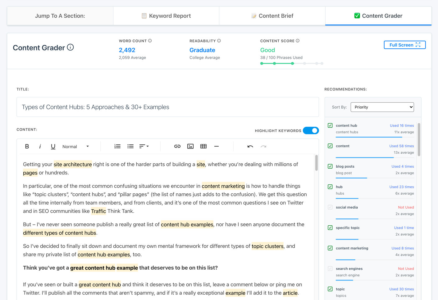
Grade your content against an AI-driven topic model using Content Harmony - get your first 10 credits for free when you schedule a demo, or sign up here to take it for a spin on your own.
✉️ Get an email when we publish new content:
Don't worry, we won't bug you with junk. Just great content marketing resources.
Ready To Try
Content Harmony?
Get your first 10 briefs for just $10
No trial limits or auto renewals. Just upgrade when you're ready.
You Might Also Like:
- How To Create Content Marketing Proposals That Land The Best Clients
- How To Write SEO-Focused Content Briefs
- How To Create A Dynamite Editorial Calendar [+ Free Spreadsheet Template]
- The Keyword Difficulty Myth
- 12 Content Marketing KPIs Worth Tracking (And 3 That Aren't)
- How To Do A Content Marketing Quick Wins Analysis
- How to Use Content Marketing to Improve Customer Retention
- The Wile E. Coyote Approach To Content Guidelines
- Content Brief Templates: 20 Free Downloads & Examples
- How To Find Bottom of Funnel (BoFU) Keywords That Convert
- Bottom of Funnel Content: What Is BOFU Content & 10 Great Examples
- 20 Content Refresh Case Studies & Examples: How Updating Content Can Lead to a Tidal Wave of Traffic 🌊
- How to Create Editorial Guidelines [With 9+ Examples]
- Content Marketing Roles
- The Content Optimization Framework: [Intent > Topic > UX]
- How To Update & Refresh Old Website Content (And Why)
- 16 Best Content Writing Tools in 2024 (Free & Paid)
- How to Create a Content Marketing Strategy [+ Free Template]
- What Is A Content Brief (And Why Is It Important)?
- There's A Better Way To Measure Keyword Difficulty