The following audio slideshow and article is a recap of a presentation I gave for DistilledLive’s Better Content Marketing Meetup on March 5th, 2013.
Click play on the embedded SlideShare to hear my voiceover of the slides, or you can read the article version of the presentation content below that.
View and Listen to the Slides and Audio
Links for My Co-Presenter
I presented alongside Adria Saracino of Distilled. She gave a great presentation titled “Making Cool Sh!t Isn’t Content Marketing” – I’d highly recommend checking out those slides as well as her recent articles on SEOMoz, “How to Get Your Boss to Care About Content Marketing“, and Distilled.net, “Kill It In Content Creation By Knowing Your Customer Conversion Funnel.” Each article is a good precursor to her presentation.
Better Content Marketing
The DistilledLive meetup theme was Better Content Marketing, and I want to start off by taking a second to talk about why we’re talking about better content in the first place.
I think most companies find themselves in one of two positions:
- Either they are in the middle of a content arms race, where their competitors are producing lots of content. They’ve got their content calendar dialed in and so does everyone else.
AND / OR - They are still getting by on crap content. Maybe they bumped it up to 600 words instead of 400 and now they add a second photo, but it’s still basically the same junk they were making in 2008/9/10 before Panda.
There’s been a lot of people talking about this lately:
- Crap: The Single Biggest Threat to B2B Content Marketing
- Cutting through the Clutter as the Content Channel Clogs
- Why Our Content SUCKS
- How to Win a Content Arms Race – Whiteboard Friday
So, I think the question we need to ask ourselves in both of these situations is this:
“How do we make better content that sticks out?”
Where Does Data Fit In?
My premise for you today is that you should be using data-based content to achieve both goals.
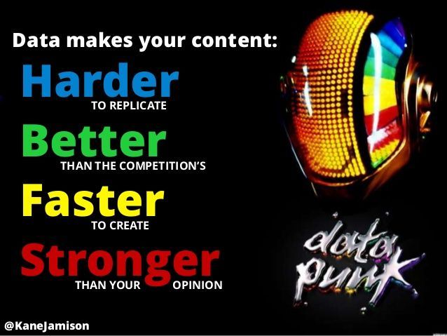
This is because data makes your content:
- HARDER to replicate
- BETTER than the competition’s
- FASTER to create
- STRONGER than your opinion

What Do You Mean By Data-Based Content?
I should probably give some examples of what I mean by data-based content. I’m not talking about data-driven content in the sense that you are driven by metrics and KPIs and things like that. That’s great but it’s not my focus tonight.
What I am talking about is more along the lines of what usually comes to mind when I say data-based content:
Infographics
- example given: http://www.alternateenergyhawaii.com/tax-credits-incentives
Data-Heavy Blog Posts
- example given: http://blog.uber.com/2012/01/09/uberdata-san-franciscomics/
Interactive & Parallax Scrolling Visualizations
- example given: http://www.truckerclassifieds.com/truckpocalypse/
Quarterly Whitepapers & Industry Benchmarks & Similar Reports
Data “Snippets” Mixed with Persuasive Copy
- examples given: http://www.charitywater.org/whywater/ & http://www.rimmkaufman.com/
Data Built Into E-Commerce Landing Pages
- example given: Amazon Kindle landing page graphs for wi-fi speed and I also referenced this post by John Henry Scherck: What’s Your Landing Page’s Unique Ranking Proposition?
APIs
- example given: http://www.programmableweb.com/has tons of great examples
Tools
- example given: the ShareMetric Chrome extension we just released
These are the types of content that set you apart in a content marketing arms race.
Data Makes Your Content Harder to Replicate
So diving right in, data makes your content harder to replicate. I mean this in a couple ways:
1 – Data seems like a big hurdle.
It takes work. You have to find the data. You have to drop it in yourself and mess around with it before whipping it into the format that’s just right. You have to merge different data sources.
All of this is enough to scare off the lazy competition.
What they don’t know, however, is that it gets easier, especially if you do this on a recurring basis. Once you’ve done this once or twice and wrapped your head around what needs to get done, this process goes much faster and you can do a better job in a shorter period of time.
2 – By using internal data that can’t be replicated.
If you’re working with a web based or start-up company, you have no excuse to not be doing things like what Uber has done with cab rides going in and out of San Francisco. Every single startup has this type of data to work with, and I think their customers find it fascinating much of the time.
Offline companies have internal data, too – it’s not just the online companies. Examples include customer service logs, paper logs of any kind, and even custom created data for the content you want to create.
This type of content is hard to replicate by the competition, and it’s another hurdle for them to clear to catch up to you.
Data Makes Your Content Better Than The Competition’s
Data also makes your content better than the competition’s content.
The best example I can come up with is Nate Silver and the Five Thirty Eight blog. He is a former baseball statistician who moved into politics, and upended the political election analysis industry in the process. He basically took all the same polling data and all of the same external data that all of the other political pundits had to work with and he took a science-based approach to analyzing it.
Instead of just speculating based off exit polls like other pundits, he made estimates based upon current and historical data and said “based on past results where we saw X, this is what we expect.”
His track record is great:
- 2008 Presidential Race: 49 out of 50 states correct (98%)
- 2008 Senate Races: 35 out of 35 races correct (100%)
- 2012 Presidential Race: 50 out of 50 states correct (100%)
- 2012 Senate Races: 31 of 33 races correct (94%)
If we take a look at his subdomain homepage, the social sharing data supports this. Facebook, Twitter, Google+, and LinkedIn counts were used:
- http://fivethirtyeight.blogs.nytimes.com/ has ~208,000 social shares.
- http://www.nytimes.com/ has ~2+ million social shares.
- http://www.foxnews.com/ has ~484,000 social shares
This is a relatively small team of content creators that he’s working with, and they’ve accomplished this over the past 3 years since the website was transferred to the New York Times domain.
I think in 2-3 years when we start the next presidential election process, you’re going to see a lot of attempts to copy this approach, especially at major TV networks. But, they’re years behind because Five Thirty Eight has already established themselves as the data-based coverage source.
Data Makes Your Content Faster to Create
It does in a couple of ways.
1 – Data-based content is easy to replicate across many pieces of content.
I think a good example of this in SEO world is Mozcast.com, a side project by Dr. Pete over at SEOMoz.
His initial dataset has become a recurring daily data set, and has produced a huge amount of content for him & Moz:
- Initial presentation when launched at MozCon
- Microsite / Tool
- He’s got blog content ideas for the foreseeable future simply by reviewing the story that the data is telling, and has produced quite a ton of content already just based off this data set.
- To top it all off, the domain has it’s own widgetbait.
The current results 9 months later? 421 linking root domains sitewide, and about 3000 social shares.
Pretty good for what started as a side project. I think that’s a great example of how you can produce a large quantity of quality content from one initial data source.
2 – Data-based content makes easy recurring content.
Data-based content is great for recurring pieces of content. Things that are done quarterly, annually, etc. These are all types of content that we are familiar with:
- Industry Benchmarks
- Annual Surveys
- Voting & Awards
- Industry Trend Analysis
A great example is Mailchimp’s Email Marketing Benchmarks by Industry.
They update this periodically and over time it’s accumulated at least 220 linking root domains and ~2000+ social shares.
So that’s an excellent example of content that’s recurring, updated once in a while, but it’s an ongoing resource for people to access.
And of course, the best part about recurring content is that your outreach does itself, because you do it once, and all you have to do is keep reaching out to the same people that already talked about it and they will keep talking about it, assuming it’s still interesting.
Data Makes Your Content Stronger Than Your Opinion
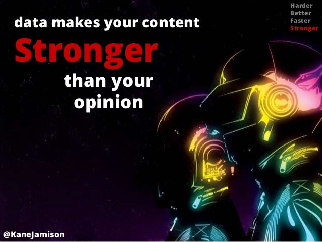
Finally, data makes your content stronger than your opinion.
“If we have data, let’s look at data. If all we have are opinions, let’s go with mine.”
–Jim Barksdale former Netscape CEO
At first I didn’t have an example of content for this point. But then, the day of the presentation, Geoff Kenyonpublished his post on testing whether 302 Redirects Pass Link Equity.
Instead of simply writing a blog post with his thoughts on what types of value search engines might place on 302 redirects, he went and tested it. Within about three hours after launch, it had 90 tweets, including tweets from some widely-followed SEOs.
Basically by going back and looking at an assumption we all thought was a closed discussion, Geoff found a way to rise above the clutter. It’s not his opinion or speculation, it’s based upon evidence – “look what I saw.”
I think that’s huge, especially in an industry like marketing where there is a lot of speculation.
But it doesn’t matter what industry you’re working in – having data that backs up your opinion makes your opinion stronger.
So here is the example that I was going to include for how to make this point actionable – it’s not all that different from what Geoff did.
- Pick an industry controversy or long-held assumption. All industries have some sort of controversy, even supposedly boring industries.
- Construct a way to test it.
- Execute the test.
- Publish the results.
- Reach out to all the people that have talked about this in the past.
You’ve got immediate buy-in by these people because they’re vested in the discussion one way or another. You are not trying to convince them to talk about something that they may or may not care about. So I love the fact that it also has the built in audience established before we start the project.
3 Resources For Getting Data
All right, so now I just want to talk about some resources for acquiring data, working with data and visualizing data. Most of these are beginner friendly or should be accessible to your typical internet marketer with some technical skills.
1 – ScraperWiki
This one is an interesting one.
So a lot of times data is not accessible through a data-set or API and if it’s still public, then the next way to get it is to scrape it off of the website. Scraping is just pulling the data easy using a software. So this creator wiki tool is kind of cool. You can build scraper, but you can also fork other peoples scrapers just like GitHub. So you can borrow somebody else codes, switch a humor here and there and all of a sudden, it is doing your bidding. The other guy built it, and it allows you to save that information to a data base or data base service. You can set it up to link o your data link and you can pull it out during API or Excel file or [inaudible 00:13:11]. So I built one of these in four or five hours in Python, that would scrape a government table, that I knew is updated daily but the data isn’t released in any fashion other than a home webpage. So now I got that data in the data base, updated daily which nobody else has except for the organization themselves. You got to careful about copyrights and things but [inaudible 00:13:34] when you publish stuff. And like I said, it took me four or five hours to build in Python. I don’t work with Python, I am not a programmer. I just hacked up somebody else code and not very [eloquently], but it worked. It does not produce errors. So that’s very ready get some data that is not fully sacrificed.
2 – Mashape.com & ProgrammableWeb.com
APIs may seem a bit scary, but Mashape.com has some great resources where they actuallygive sample code to help you pull from each one of their APIs
Once you get the handle on that process, you can head over to a website like ProgrammableWeb which is an API directory with ~9000 APIs, find the data set you are looking for, and pull that data out.
3 – Visualize Other People’s Data That’s Already Seen Internet Success
So this third one is literally stolen from Russ Hudgen‘s presentation about link building by stealing. So his concept was go to website like Hacker News, where data heavy content typically does well but they don’t tend to like
visualization as a community.
Take that data heavy content that’s already produced in a cool and interesting format and visualize it, re-release it,and then reach out to the people that created in the first place and the people who talked about it in the first place.
That’s another great example where the audience is built-in before we even start the project.
2 Resources For Working With Data
This is a quirky little tool – paste your CSV data in the top half, and the bottom half will spit out HTML Tables, SQL, JSON, as well as arrays in Ruby, Python, and PHP.
2 – Data Wrangler
Data wrangler is for the Excel junkies in the room who hate the whole “Text-to-Columns” and “Concatenate” dance. It kind of does this artificial intelligence approach to unstructured data manipulation that takes so much time.
4 Resources For Visualizing Data
1 – Timeline.JS
This one I put first because it is so obnoxiously easy. You don’t have to know any Java Script. You don’t need to know any code. All you need to know is how to copy a public Google doc template that has 5 to 8 columns.
Put some dates, titles, and text in the template. This tool will take the doc and create this cool timeline visualization. It is automatically swipeable on iPad, iPhone, tablet, etc. You can embed it into an existing site, make a micro-site out of it, all of that good stuff. Timeline.js has a WordPress plugin, too.
If you got a concept like the history of your industry, the history of your product, or the history of your company, you can create a cool piece of content in an afternoon using this tool.
2 – Google Fusion Tables Tutorials
Both have great code examples for simple things like graphs and line charts, and they can ease you into the more advanced stuff.
This is the first resource to check out when you are ready to do the big data-based content projects, even if you’re not going to do it yourself. It’s great for getting ideas about the types of tools available and what you can produce, even if you’re hiring a more advanced datavis expert to assist with the project.
✉️ Get an email when we publish new content:
Don't worry, we won't bug you with junk. Just great content marketing resources.
Ready To Try
Content Harmony?
Get your first 10 briefs for just $10
No trial limits or auto renewals. Just upgrade when you're ready.
You Might Also Like:
- The Wile E. Coyote Approach To Content Guidelines
- Content Brief Templates: 20 Free Downloads & Examples
- The Keyword Difficulty Myth
- How To Find Bottom of Funnel (BoFU) Keywords That Convert
- Bottom of Funnel Content: What Is BOFU Content & 10 Great Examples
- 20 Content Refresh Case Studies & Examples: How Updating Content Can Lead to a Tidal Wave of Traffic 🌊
- How to Create Editorial Guidelines [With 9+ Examples]
- Content Marketing Roles
- How To Write SEO-Focused Content Briefs
- The Content Optimization Framework: [Intent > Topic > UX]
- How To Update & Refresh Old Website Content (And Why)
- 12 Content Marketing KPIs Worth Tracking (And 3 That Aren't)
- 16 Best Content Writing Tools in 2024 (Free & Paid)
- How to Create a Content Marketing Strategy [+ Free Template]
- How To Create Content Marketing Proposals That Land The Best Clients
- What Is A Content Brief (And Why Is It Important)?
- How To Create A Dynamite Editorial Calendar [+ Free Spreadsheet Template]
- How to Use Content Marketing to Improve Customer Retention
- Types of Content Hubs: 5 Approaches & 30+ Examples
- How To Do A Content Marketing Quick Wins Analysis