Overall Vibe:
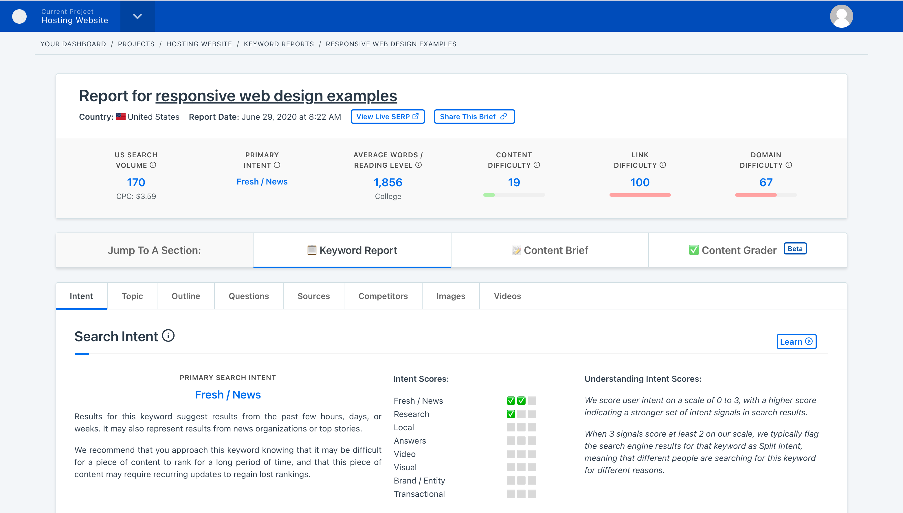
Our customers are smart & creative marketers and so are we. We try to be positive and informative and help marketers level up.
We’ve been in-the-trenches content marketers and we understand the problems that our customers face. Our brand copy should convey that in a friendly and welcoming way.
Best Practices
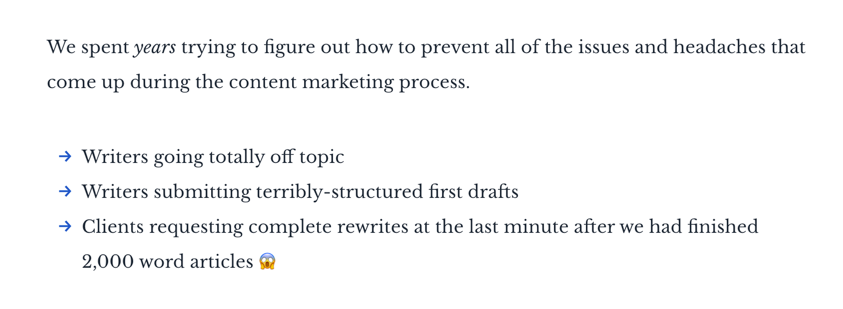
When writing for Content Harmony, please follow the best practices that are outlined below.
Use Clear Language
Write common English words, not jargon.
Examples:
- Write “use” not “utilize”
- Write “buy” not “purchase”
- Write “because” not “due to the fact that.”
Write Short Sentences and Paragraphs
As with words, shorter sentences also promote comprehension. Short paragraphs make your piece more readable, especially on the web.
As a general guideline, keep paragraphs limited to three sentences or less.
Write in Active Voice
Active voice makes writing shorter, clearer, and more lively. Passive voice, while sometimes necessary, tends to clutter the page and distract from the message.
Examples:
- Write: “Content marketers love experimenting with new content formats and tactics." not "Experimenting with new formats and tactics is a habit of content marketers."
Get To The Point
We’re marketers and storytellers at heart, but we respect our audience’s time and we don’t want to bore them.
Hence, we prefer to get to the point as fast as possible. Long, flowery introductions to the topic you’re writing about aren’t needed since our audience aren’t novices to the industry and live busy lives.
Style Guide & Word List
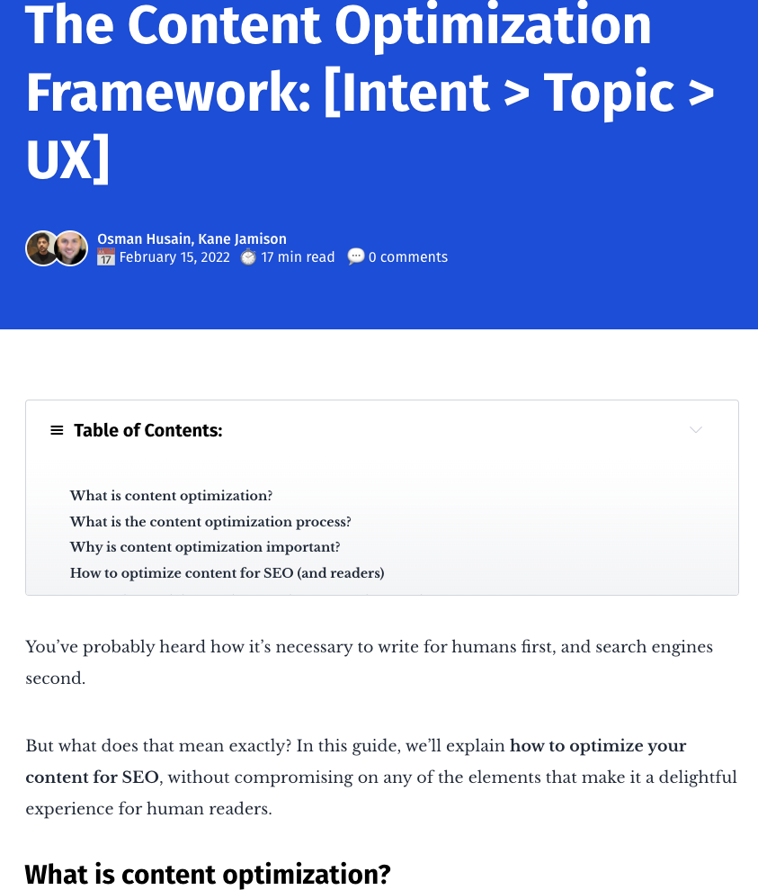
Please take a deeper look at our style guide and word list, which goes into specific phrases, acronyms, abbreviations, and other industry jargon you'll want to use (or avoid) when writing for Content Harmony.
Content Guardrails
Guardrails are things that we avoid, or have specific rules in how we talk about them.
Humor & Pop Culture:
Humor is good but we never want to be sarcastic or negative.
Nerdy/pop culture references are fair game. Our audience is into that.
Competitors:
In day-to-day blog posts and content, we generally don’t mention competitors at all, or if we do, we will usually refer to them as a category (eg “content graders”).
For tone & voice purposes, competitors are any tools that primarily help create briefs or optimize content. We don’t consider broader industry tools (eg Ahrefs) to be competitors.
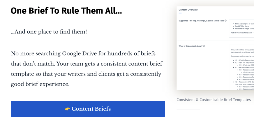
On a few critical product pages, we do get slightly more aggressive. For example, here is what we do on our Content Grader product page, which takes a small dig at the “A/B/C/D/F” grading scale that many of our competitors use:

But, it is very rare that we would mention a competitor by name outside of our Content Harmony Alternatives pages.
Politics:
Kane has some pretty strong feelings here, but Content Harmony as a brand doesn't.
We would generally avoid using political references or examples in our day-to-day content efforts. Exceptions might include a blog post specifically about how content marketing is used on political campaigns, but those are uncommon.
With that caveat, Content Harmony is still happy to support specific initiatives and causes that other people might confuse as political in nature. For example, we support carbon reduction efforts through Stripe Climate, and we're proud to share that with our customers.
Emojis:
Emojis are very on-brand. We use them for color/personality especially since "blue and white" can be boring brand colors without them.

Emoji Frequency:
- We use emojis one at a time in headlines and body copy - we don’t stack them or cluster them like ❤️❤️❤️
- We also don’t stuff the page with too many of them. For example, the user shouldn’t be reading a blog post and see 5 sentences that all end with emoji punctuation.
- Using repeated emojis in headings through a blog post is allowed and sometimes encouraged. See our Content Marketing Roles post as a good example.
Our navigation/footer menus are one exception to the overall frequency rules. You can find heavy emojis both in our navigation on the marketing website and inside the app itself. We use them where other apps might have used icons.
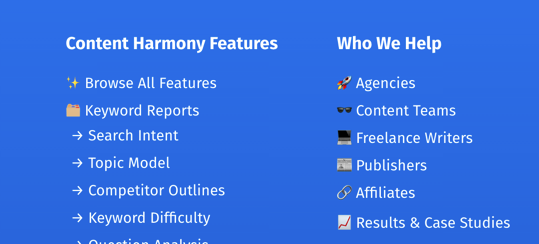
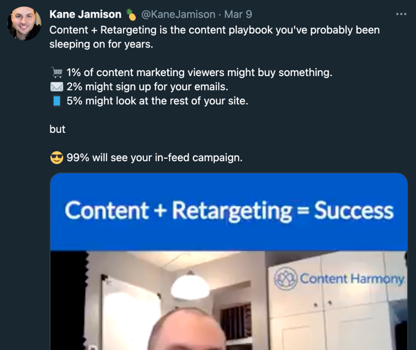
Using repeated emojis in a well-structured way like a list can be OK if it’s not forced. Here is an example of using them in lieu of bullets:
Jump to a Brand Guidelines Section: Philosophy | Voice & Tone | Editorial Guidelines | Our Audience | Word List | Visual Guidelines | Web Elements
