Notable Content Performance Metrics:


Content Formats:
- 📊 Infographics & Data Visualization
Marketing Objectives:
- 📈 Brand Awareness
- 🎗 Cause Marketing
Industry / Business Model:
- 🏡 Home & Garden
- ⛑ Non-Profits
Water Use It Wisely is a collaboration between multiple Arizona water agencies who realized—”People save water the same way in Phoenix that they do in Mesa, so why not speak with one voice?”
As it turns out, the voice they used was so powerful, they’ve created one of the web’s most shared, most linked-to content pieces about water conservation: Their 100+ Ways To Conserve Water Guide.
Their water conservation guide has been shared more than 18,000 times on Facebook, nearly 4,000 times on Pinterest, and ranks on the first page of Google results for key searches like “how to save water” and “ways to conserve water.”
Why has this piece of content been so wildly successful?
It’s Easy To Find A Tip You Care About
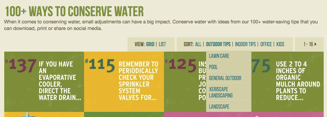
The list is organized multiple ways, all of which make it simple for someone to find a tip that applies to their personal situation or their audience.
You can view the tips organized by “outdoor tips”, “indoor tips” “kids” and “office.” Or, you can see them all at a glance in the list view. You can drill down ever further if you like, into categories like “kitchen” and “lawn care”.
It Feels Comprehensive
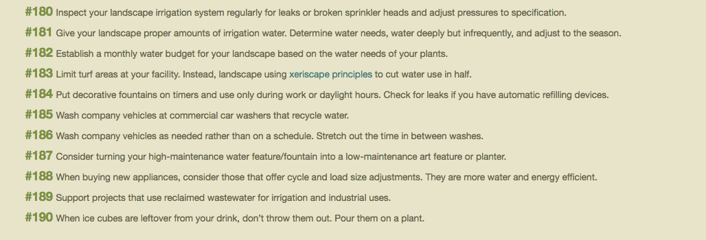
100+ ways — that’s a lot of ways. More isn’t always better: 100+ ways to make toast would feel like way too many. But for an important topic like water conservation, that number feels right. By publicizing the guide as “100+”, rather than a specific number, Water Use It Wisely’s content team can always add new ways as they learn about them. As I write this, their list is up to 190.
It’s Easy To Share
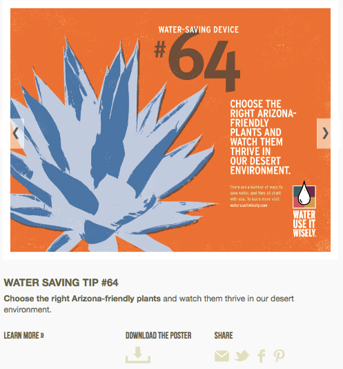
The gallery view for each tip offers share buttons for the major social networks, as well as a download button for people who want to manage the process themselves. Giving people multiple options to share not only make it easy on them, but also gives them tacit permission to spread your message far and wide. Make sure you make it clear—we want you to share!
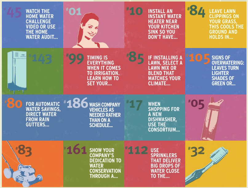
It Uses A Variety Of Pleasing But Impactful Color Combinations
The creators of this content could have just confined their color usage to the brand colors, or to approved combinations. Instead, they created a palette of color combinations that both give the page variety but also encourage shares and clicks. The designers leaned heavily on primary colors like blue, red, and yellow, plus warm colors like orange, green, and pink.
The designers obviously have a strong grasp of how colors work together, because they all play well together on the page—if a non-designer tried this, they could end up picking colors that clash.
Some big companies are experimenting with using multiple colors in their branding. See how Dropbox has reimagined their branding, for example.
It Uses A Consistent Layout
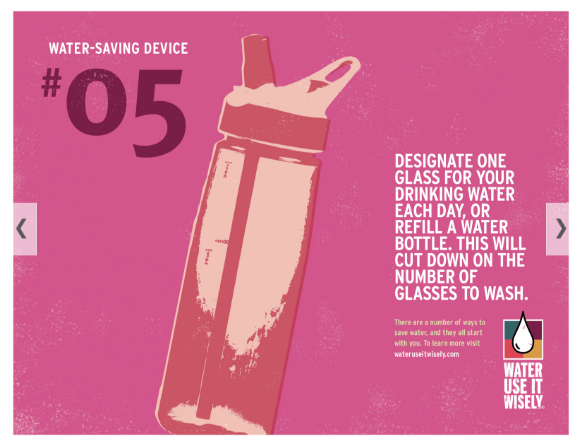
Still, if you’re going to create 100 of anything, you need a template. The designers were smart to make color the element that gives this piece variety, since that’s such an easy change to make. All of the designs feature a standard layout. Any imagery used in the designs uses a standard filter as well.
It’s Evergreen
The vast majority of the tips in the guide will be as applicable in 20 years as they are right now. (Although, hopefully, if we all follow the advice in the guide, they won’t be as necessary.)
✉️ Get an email when we publish new content:
Don't worry, we won't bug you with junk. Just great content marketing resources.
Ready To Try
Content Harmony?
Get your first 10 briefs for just $10
No trial limits or auto renewals. Just upgrade when you're ready.
