We’ll walk through how you can use the insights from our Image Analysis to produce better content.
We use Image Analysis in a few different ways:
Understanding Common Visual Elements That Google May Think A User Is Looking For
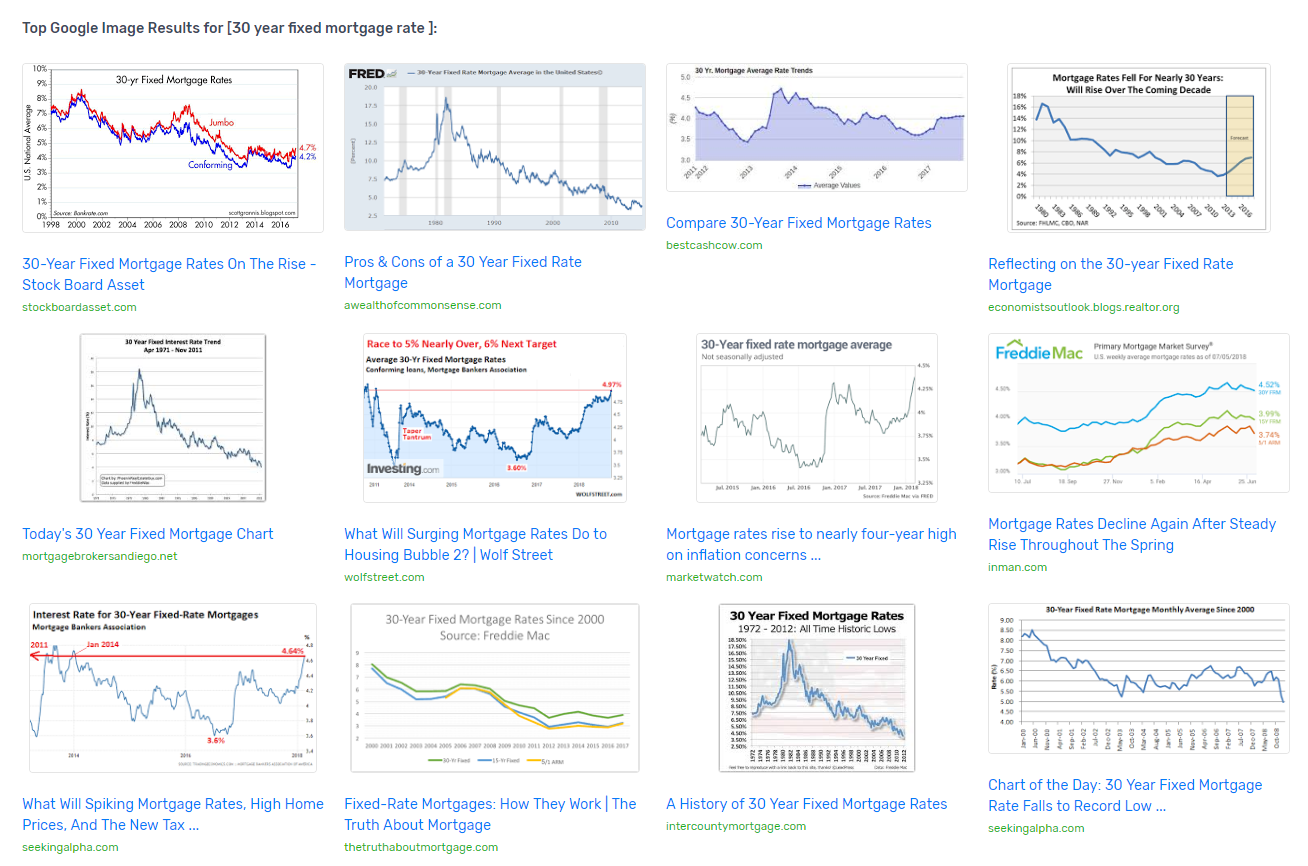
While reviewing the Image Analysis, you’ll quickly noticed trends. For example, users searching for [30 year fixed mortgage rate] and probably expecting to see charts and trends:

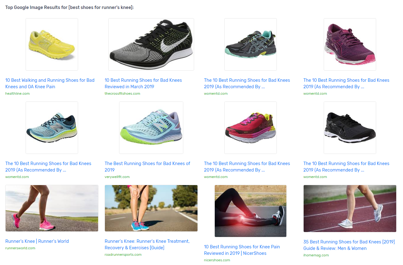
Likewise, users searching for [best shoes for runner’s knee] are probably expecting to see images of the recommended shoes, and the typical stock photos for knee pain:

You don’t have to include exact imagery from what other people are using – sometimes it can be better to break these types of trends – however it’s not unlikely that Google can view and understand what these images are about (just drop an image in Google Reverse Image Search and they’ll tell you what the image is).
It’s also reasonable to guess that they recognize patterns when users related to Click Through Rate and Bounce Rate when users click results that have these types of visual assets.
Building Better Suggestions for Your Graphic Designers
It’s time consuming to produce custom visual assets for every piece of content. Understanding what other people are using in their own content makes it easier to quickly hone in on what visual elements you might want to add to your own content.
In our past writing process as an agency, we would have our writers and content strategists form “Design Prompts” for graphic designers, suggesting required content elements for that project.
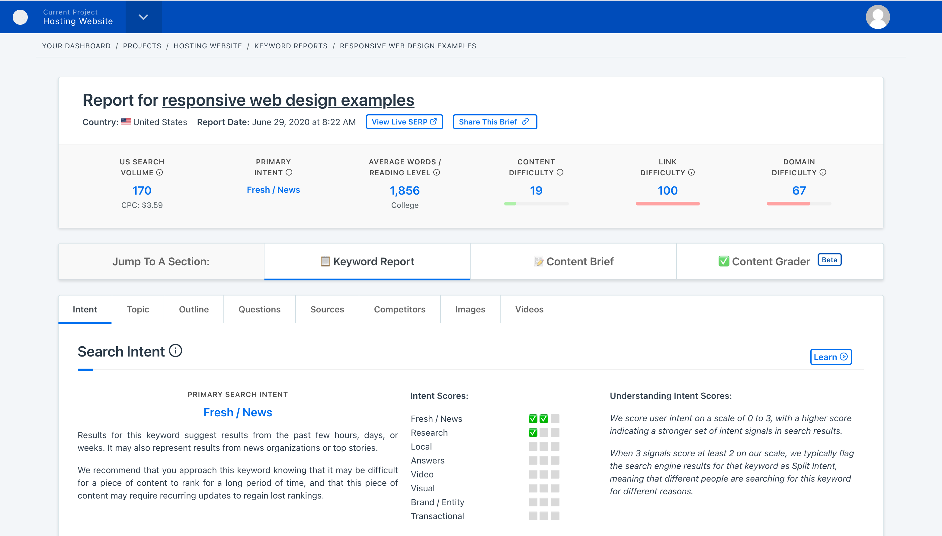
You can leave notes on your highlighted images in the Content Brief.
